Case study · Looker Studio
Orders Dashboard
An interactive Looker Studio dashboard for a retail orders dataset, built so stakeholders can filter by region, segment, category and ship mode and find their own answers without waiting on a report.
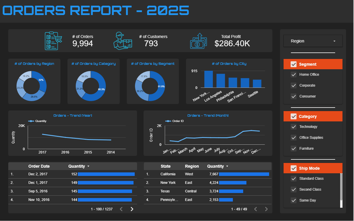
9,994Orders
793Customers
$286.4KTotal profit
49States
The ask
Give stakeholders one view of order performance: headline KPIs, how orders split by region, category, segment and city, how volume trends over time, and filters to drill into any slice without a new report request.
How I built it
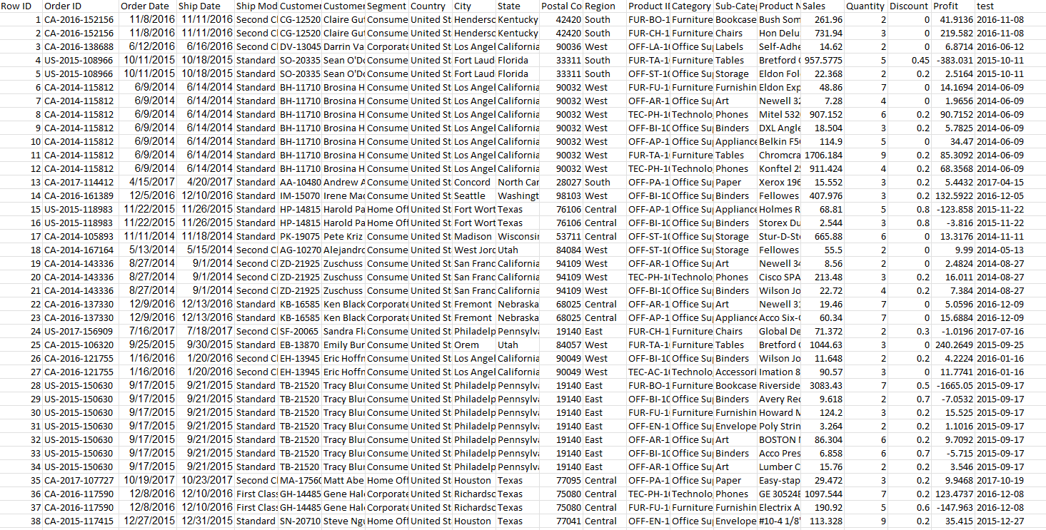
- Step 1Prepared the data in ExcelCleaned the order, customer, product and profit data, standardizing date formats and category fields.
- Step 2Designed the KPI layerOrders, customers and profit up top, then orders by region, category, segment, city and state, plus yearly and monthly trends.
- Step 3Built the interactive layerFilter controls for region, segment, category and ship mode that update every chart at once, plus sortable tables.
What the data showed
- Office supplies make up 60% of orders, and the consumer segment accounts for 52%.
- The West is the largest region at 32% of orders, and New York City is the top city.
- California leads every state with 7,667 units ordered, well ahead of New York at 4,224.
- Orders climb through the year, with the busiest months from September to December.
Next projectSales Management Dashboard →
Get in touch
